Prompt
Description
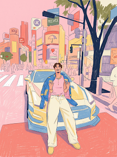
Prompt : Use the uploaded image ONLY as a composition and subject reference. Preserve the original camera angle, framing, perspective, pose, proportions, object placement, and storytelling exactly. DO NOT preserve the original rendering. Completely redraw the entire image from scratch as if an editorial illustrator created it by hand. The final artwork should NOT look like a photo that was stylized. It should look like an original illustration that just happens to depict the same scene. Imagine an experienced editorial illustrator creating artwork for a premium magazine cover. The illustration should feel handcrafted, expressive, imperfect, and tactile. Every line should look intentionally drawn by a human. Nothing should feel digitally painted. Nothing should feel AI generated. Begin by creating a loose graphite construction sketch. Draw expressive uneven outlines using dark navy graphite pencil. Block large flat colour shapes using wax crayons. Build texture using coloured pencils. Leave visible sketch marks, rough edges, and imperfect strokes. The construction drawing should still be subtly visible underneath the colours. This is extremely important: treat every object as graphic design instead of realism. Reduce every object to approximately 35% of its real-world detail. If something contains 20 details, draw only 6. Simplify. Omit. Abstract. Never render. Buildings become large coloured blocks. Cars become bold geometric shapes. Trees become simple silhouettes. People become expressive graphic figures. The linework should be loose, expressive, uneven, broken, hand drawn, with a slight wobble, visible pressure changes, and created using dark graphite and dark navy. Never perfectly clean. Never vector. Never digital ink. Every single surface must contain visible handmade texture created with wax crayon, oil pastel, coloured pencil, dry graphite, paper grain, broken pigment, uneven colour coverage, visible overlapping strokes, and visible hand pressure. Nothing should ever be smooth. Nothing should ever look digitally brushed. Do NOT preserve realistic colours. Instead, completely remap the image into a limited editorial palette. The dominant colours are bubblegum pink, salmon pink, coral, warm peach, butter yellow, cream, off-white, dusty olive, muted forest green, muted lavender, dusty purple, sky blue, deep navy, and warm orange. Choose colours for graphic harmony instead of realism. Roads may become pink. Buildings may become coral. Concrete may become cream. Trees may become olive. Reality should be sacrificed for colour harmony. Lighting should be almost completely flat. Ignore realistic lighting, reflections, realistic materials, ambient occlusion, and glossy surfaces. Use only one simple shadow colour. Keep everything bright, graphic, and minimal. Stylize the people with long limbs, simple hands, minimal facial features, graphic clothing folds, no realistic muscles, no skin rendering, and no pores. Faces should be simplified to essential shapes. Render buildings as large graphic blocks with very few windows, loose perspective, slight geometric imperfections, and no architectural precision. Vegetation should feature palm trees with long exaggerated trunks, loose leaves, minimal detail, and graphic silhouettes. Reduce vehicles into bold simple shapes with minimal reflections, minimal perspective detail, minimal chrome, and graphic silhouettes. The sky should be a flat pastel blue with loose white crayon clouds, visible chalk texture, and very minimal rendering. The overall mood should feel warm, relaxed, dreamlike, nostalgic, California-inspired, Vice City-inspired, editorial illustration, graphic design, and contemporary illustration. Most importantly, do NOT stylize a photograph. Completely redraw the image. The final artwork should feel like it was illustrated manually by an artist using wax crayons and coloured pencils on textured paper. Someone seeing the artwork should immediately think, “This is an original hand-drawn editorial illustration,” NOT, “This is an AI filter.” Negative prompt: No digital painting, no concept art, no comic book, no cel shading, no anime, no Pixar, no 3D, no vector art, no clean digital brush, no smooth gradients, no glossy rendering, no realistic textures, no realistic lighting, no photorealism, no polished rendering, no airbrushing, no digital ink, no highly detailed architecture, no highly detailed foliage, no painterly brushwork, no oil painting, no watercolor, no AI-generated look. Everything should feel imperfect, tactile, expressive, and unmistakably hand drawn.
The Prompt
Prompt : Use the uploaded image ONLY as a composition and subject reference. Preserve the original camera angle, framing, perspective, pose, proportions, object placement, and storytelling exactly. DO NOT preserve the original rendering. Completely redraw the entire image from scratch as if an editorial illustrator created it by hand. The final artwork should NOT look like a photo that was stylized. It should look like an original illustration that just happens to depict the same scene. Imagine an experienced editorial illustrator creating artwork for a premium magazine cover. The illustration should feel handcrafted, expressive, imperfect, and tactile. Every line should look intentionally drawn by a human. Nothing should feel digitally painted. Nothing should feel AI generated. Begin by creating a loose graphite construction sketch. Draw expressive uneven outlines using dark navy graphite pencil. Block large flat colour shapes using wax crayons. Build texture using coloured pencils. Leave visible sketch marks, rough edges, and imperfect strokes. The construction drawing should still be subtly visible underneath the colours. This is extremely important: treat every object as graphic design instead of realism. Reduce every object to approximately 35% of its real-world detail. If something contains 20 details, draw only 6. Simplify. Omit. Abstract. Never render. Buildings become large coloured blocks. Cars become bold geometric shapes. Trees become simple silhouettes. People become expressive graphic figures. The linework should be loose, expressive, uneven, broken, hand drawn, with a slight wobble, visible pressure changes, and created using dark graphite and dark navy. Never perfectly clean. Never vector. Never digital ink. Every single surface must contain visible handmade texture created with wax crayon, oil pastel, coloured pencil, dry graphite, paper grain, broken pigment, uneven colour coverage, visible overlapping strokes, and visible hand pressure. Nothing should ever be smooth. Nothing should ever look digitally brushed. Do NOT preserve realistic colours. Instead, completely remap the image into a limited editorial palette. The dominant colours are bubblegum pink, salmon pink, coral, warm peach, butter yellow, cream, off-white, dusty olive, muted forest green, muted lavender, dusty purple, sky blue, deep navy, and warm orange. Choose colours for graphic harmony instead of realism. Roads may become pink. Buildings may become coral. Concrete may become cream. Trees may become olive. Reality should be sacrificed for colour harmony. Lighting should be almost completely flat. Ignore realistic lighting, reflections, realistic materials, ambient occlusion, and glossy surfaces. Use only one simple shadow colour. Keep everything bright, graphic, and minimal. Stylize the people with long limbs, simple hands, minimal facial features, graphic clothing folds, no realistic muscles, no skin rendering, and no pores. Faces should be simplified to essential shapes. Render buildings as large graphic blocks with very few windows, loose perspective, slight geometric imperfections, and no architectural precision. Vegetation should feature palm trees with long exaggerated trunks, loose leaves, minimal detail, and graphic silhouettes. Reduce vehicles into bold simple shapes with minimal reflections, minimal perspective detail, minimal chrome, and graphic silhouettes. The sky should be a flat pastel blue with loose white crayon clouds, visible chalk texture, and very minimal rendering. The overall mood should feel warm, relaxed, dreamlike, nostalgic, California-inspired, Vice City-inspired, editorial illustration, graphic design, and contemporary illustration. Most importantly, do NOT stylize a photograph. Completely redraw the image. The final artwork should feel like it was illustrated manually by an artist using wax crayons and coloured pencils on textured paper. Someone seeing the artwork should immediately think, “This is an original hand-drawn editorial illustration,” NOT, “This is an AI filter.” Negative prompt: No digital painting, no concept art, no comic book, no cel shading, no anime, no Pixar, no 3D, no vector art, no clean digital brush, no smooth gradients, no glossy rendering, no realistic textures, no realistic lighting, no photorealism, no polished rendering, no airbrushing, no digital ink, no highly detailed architecture, no highly detailed foliage, no painterly brushwork, no oil painting, no watercolor, no AI-generated look. Everything should feel imperfect, tactile, expressive, and unmistakably hand drawn.